There is nothing quite as daunting as not being able to understand something. In the world of design, there are so many jargon words and tools that are confusing to non-designers. I want to lift the curtain on that obscurity and help you understand some of the basics. So let us begin with the very basic: the logo.
A logo is simply a visual mark that represents a company, organization, individual, or thing. It communicates quickly with an audience and is a point you want customers to remember. Humans are visual creatures and starting off with a memorable logo is essential for any business.

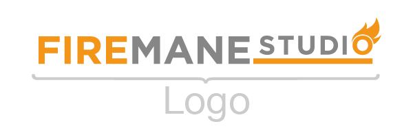
Using our company logo as an example, the entirety of the graphic is considered the logo. The letters, horizontal line, and fire emblem put together create the overall logo. As each logo can consist of different elements, the definition of the logo is the standard display of all these elements.

Within the logo is a part called the wordmark which is only comprised of type. Some logos are only made up of type. The wordmark might be the complete name of the business, an abbreviation of the name, or could be initials only.

The icon is a form of shorthand to take the place of including the entirety of a logo. This could be to save visual space, as a display feature, or common place if the brand is well known enough that the full name isn't needed. Think of the Nike swoosh as an example of an icon that works well on its own. If icons are created in the initial design, they are often integrated within the logo to become visually cohesive. Both the wordmark and icon are developed in tandem to produce a aesthetically appealing end product.
This was a quick and dirty definition of what a logo is and what parts it is made of. I believe that the best clients are well informed clients. Being able to communicate what I do as a designer and being understood by my clients makes the process easier on everyone involved.